Why Custom Fonts Win Customers
Why a custom font for your brand helps win customers: what the research found, real brand typefaces, license costs, and 3 ways a small brand can get one.
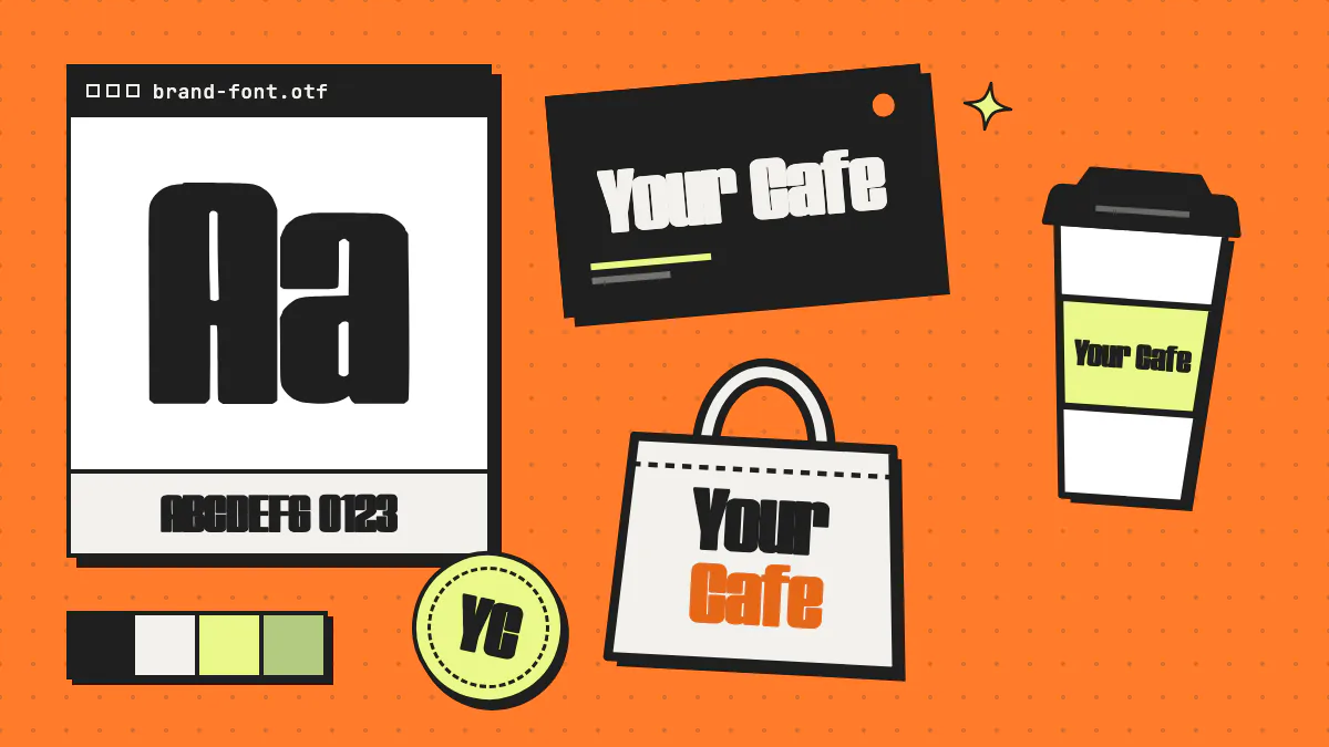
Custom fonts win customers because type is on almost everything your brand puts in front of people. It’s on the sign, the cup, the Instagram post and the checkout button. A custom font for your brand makes every one of those touchpoints look like it came from the same place, gives you letterforms nobody else is already using, and can cut the per-use license fees that come with many commercial fonts.
That’s the pitch. The evidence is real but narrower than most “fonts are magic” articles admit, so this guide sticks to what’s actually been measured, what big brands said when they switched to their own typefaces, and how a small business, creator or agency can get a brand font without a five-figure budget.
Key takeaways
- Font choice measurably affects brand choice: in a 2004 Journal of Business Research study, made-up brands set in a font that suited the product were chosen about twice as often as brands in an unsuitable font.
- Netflix, Airbnb, YouTube, Spotify and IBM all moved to their own typefaces, for reasons including font licensing costs, a distinctive look they own, and one type system that works everywhere from app buttons to billboards.
- Commissioning a typeface from a type designer costs from roughly $8,000 per style to $250,000 or more for a four-style family, according to type designer Thomas Phinney’s 2024 estimates.
- Small brands have three realistic routes to a custom font: commission a type designer, customize an open-source font, or generate a complete font with an AI font generator such as Fontjohn and refine it.
- Roll out a brand font from the logo outward: wordmark first, then packaging and signage, then social templates, then a WOFF2 web font on your website.
Why do fonts matter for branding?
Fonts matter for branding because people read personality into letterforms, not just into the words. Type sets the tone (playful, premium, technical, handmade), makes repeated touchpoints recognizable, and signals whether a brand fits what it sells. That last part has been tested: in one well-known study, made-up brands set in a font that suited the product were picked twice as often.
What the research actually found
In experiments published in the Journal of Business Research in 2004, John Doyle and Paul Bottomley showed people pairs of made-up brands in 10 product categories. One brand name in each pair was set in a font that a separate group of raters had judged appropriate for that product; the other was set in a font judged inappropriate. Brands in the fitting font were chosen twice as often, on average 67% of all choices.
The fun detail is that no font was simply “good.” Bodoni beat the script font Mistral for a car rental company, and Mistral beat Bodoni for a specialty jam brand. In a small follow-up field test, 30 of 40 university staff took a chocolate truffle from the box whose label used the fitting font.
Keep the caveats in view: the study is two decades old, the samples were modest (120 students in the first experiment, 40 people in the field test), the brands were fictional, and it tested whether a font fits a product, not custom versus off-the-shelf fonts. The honest takeaway isn’t “custom fonts sell more.” It’s that your type has to suit what you sell, and a font designed for your brand is the most direct way to control that fit.
Default fonts make you look like everyone else
Default fonts in website builders and template packs are safe and readable, which is exactly why they’re on everyone else’s menus and storefronts too. When your competitor down the street uses the same sans serif as you, your type isn’t doing much branding work. It’s just holding the words.
Which companies use custom fonts, and why?
Netflix, Airbnb, YouTube, Spotify and IBM all switched to typefaces made for them. The reasons on record go beyond looks: license costs at global scale, a look they own, one type system that works from app buttons to billboards, and letterforms expressive enough to build brand equity over years.
| Feature | Typeface | Launched | Why, according to the linked source |
|---|---|---|---|
| Netflix | Netflix Sans, with foundry Dalton Maag | 2018 | Its brand design lead told It’s Nice That that font licensing can get quite expensive for a business as global as Netflix, and that the typeface created an ownable, unique element for the brand. |
| Airbnb | Airbnb Cereal, with Dalton Maag | 2018 | A typeface that lets the brand “leap from button to billboard,” built for what its creative lead called business needs around brand distinction, legibility and scalability that no available typefaces were addressing (It’s Nice That). |
| YouTube | YouTube Sans | 2017 | With YouTube Kids, Music and Gaming on the way, a clear, recognizable logo and type system. Before that, the team had a wordmark and a play icon but no clear direction on which to use when (Google Design). |
| Spotify | Spotify Mix, with studio Dinamo | 2024 | More range, from condensed to extended, than its previous typeface, Circular, which its global head of brand design said “felt quite limiting at times,” plus characteristics unique to Spotify that it could build equity in over time (It’s Nice That). |
| IBM | IBM Plex, with foundry Bold Monday | 2017 | A corporate typeface reflecting IBM’s design principles to replace Helvetica, which also freed IBM from extensive license payments. Plex is licensed under the SIL Open Font License (Wikipedia). |
The lesson for a small brand
Look at where these typefaces came from. YouTube Sans was built on the grid of the old play icon, which shaped its angled cuts and curves. Airbnb named Cereal after the branded cereal its founders made to raise money in 2008. Both started from something that was already theirs, and you can do the same with your shopfront, your product or your hand-painted sign.
IBM adds a twist: custom doesn’t have to mean secret. Plex is open source and free for anyone to use, yet it was still designed to reflect IBM’s design principles, on license terms IBM chose.
How does brand typography keep every touchpoint consistent?
Brand typography keeps touchpoints consistent by giving every surface the same letterforms: logo, menu, packaging, social posts and website. That shared look helps people link a post or a flyer to you even when the logo isn’t in view. It’s the button-to-billboard problem Airbnb described, and it matters as much for a café as for a global app.
Without a brand font, type drifts. The freelancer who did your menu picked one sans serif, the sign shop substituted another, and your social templates use whatever was loaded in the design app that day. Each choice is reasonable on its own. Together they look like three different businesses.
A simple type system most brands can run
- One display font with real personality, for the logo, headlines, packaging, signage and social graphics. This is where a custom font earns its keep.
- One text font that’s easy to read at small sizes, for body copy, menus, ingredient lists and email.
- A few written rules: which weights to use, uppercase or not, how much letter spacing, and the smallest size each font appears at.
How does commercial font licensing work for a growing brand?
Commercial fonts are often licensed by use rather than bought once for everything, so the cost depends on where the font appears. At the foundry TypeType, for example, desktop licenses are priced by the number of computers, web fonts by monthly pageviews, app licenses by the number of apps, and digital ad licenses by impressions. That’s manageable for one designer and one website, but the bill grows as a brand adds staff, sites, apps and campaigns.
TypeType’s licensing page lists separate desktop, logo, webfont, app, digital ads, video, e-book and server licenses, among others, each priced by its own measure (as of September 2026). That’s how type designers get paid, and it’s fair. It’s also why license costs came up when Netflix and IBM moved to their own typefaces. A small brand won’t face bills that size, but it may find the font bought for the logo doesn’t cover the website, the app or paid ads.
How do you get a custom font for your brand on a budget?
There are three realistic ways to get a custom font for your brand. Commission a type designer for the most control at the highest cost. Customize an open-source font, which costs nothing to license but isn’t exclusive. Or generate a complete font with an AI font generator and refine it, which is fast and inexpensive, though you steer with prompts and edits rather than drawing every curve yourself.
1. Commission a type designer
The gold standard: a professional designs letterforms around your brand, with the weights and language support you specify. In a 2024 breakdown of custom typeface costs, type designer Thomas Phinney estimates $100,000–250,000 and up for a four-style typeface from a famous designer with temporary exclusivity, roughly $30,000–75,000 for about the same from an established but not famous designer, and as low as $8,000–25,000 per style from designers early in their careers. He notes a famous designer’s project might take a year or more.
2. Customize an open-source font
Fonts under the SIL Open Font License (OFL) are free to use, and the official OFL FAQ lists logos, signage and t-shirts among the design work you can make with them. You can modify the font too, but a modified version you distribute must stay under the OFL, and needs a new name if the original reserves its own. You’ll need font-editing skills or a designer’s time, and anyone can still use the original.
3. Generate a font with AI
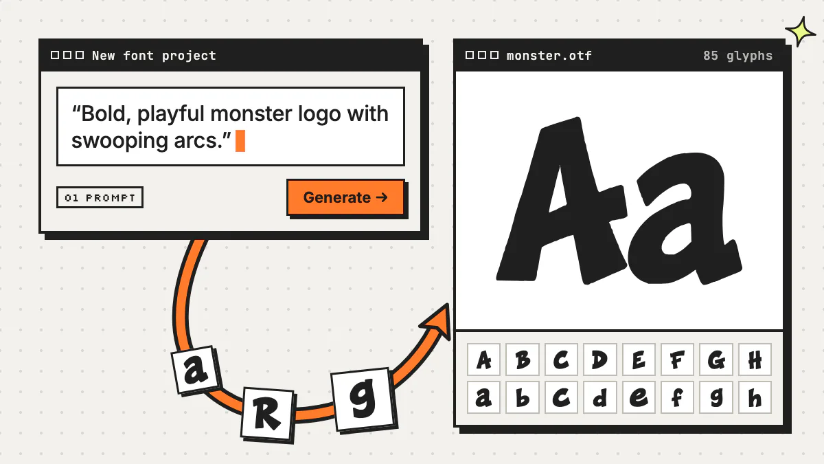
Fontjohn is an AI font generator: describe a style in a sentence or upload a reference image, and it generates a complete, installable font with 85 glyphs (A–Z, a–z, 0–9 and 23 punctuation marks) in roughly 30–90 seconds. You refine the outlines and kerning, then export. You own the fonts you generate, and paid downloads include a commercial license with no royalties or watermark. The trade-off: you steer with prompts, references and edits rather than a designer’s months of drawing. Our step-by-step guide to making a font with AI walks through each screen, and Fontjohn vs ChatGPT explains why a chatbot’s alphabet image isn’t a font.
| Feature | Commission a type designer | Customize an open font | Generate with Fontjohn |
|---|---|---|---|
| Cost | From $8,000–25,000 per style (early-career designers) to $100,000–250,000+ for a four-style family from a famous name, per Thomas Phinney’s 2024 estimates | The font is free; you pay in your own time or a designer’s hours | Free to design and type-test 1 font a month; downloads need a paid plan, such as Pro at $20/month or $200/year (see plans) |
| Time | A famous designer might take a year or more, per Phinney | Depends on your font-editing skills | About 30–90 seconds for the full sheet, plus your refining time |
| Exclusivity | Negotiated; Phinney’s top estimate assumes temporary exclusivity, and he suggests doubling the price if you want to own the rights | None; anyone can use the original font | You own what you generate, and every run draws different glyphs, though anyone can prompt a similar style |
| License terms | Set by your contract | SIL Open Font License; modified versions you distribute stay under the OFL | Commercial license on paid downloads, no royalties, no watermark |
| Characters | Whatever you commission; Phinney’s estimates assume a Western plus Central European character set | Whatever the original font includes | 85 glyphs; Latin expansion adds accented letters for 40+ European languages plus symbols like € and £ (3 fonts a month on Pro, 10 on Studio) |
| Best for | Established brands with budget and a long runway | Brands happy with a familiar look plus tweaks | Small brands, creators and agencies who want a distinct display font fast |
Designing fonts for clients rather than for your own brand? Our guide to making money selling fonts covers pricing custom font projects and writing usage terms.
When a stock font is the better call
If you’re still figuring out what your brand stands for, pick a good open-source font and revisit later. Monotype’s article asks exactly that: who are you as a brand, and does everyone in the organization share that vision? For long body text, a proven, readable text font beats anything expressive. A custom font shines on the display layer: the name, headlines and packaging.
How do you brief a custom font style?
Brief a brand font by describing personality and use, not only looks: three adjectives, where the font will appear, what it must never feel like, and one or two visual references. The same brief works for a type designer or an AI prompt, and clearer constraints usually mean fewer revision rounds.
What to put in the brief
- Personality in three words. “Warm, scrappy, local” leads somewhere very different from “precise, calm, premium.”
- The main job. Logo and headlines only, or small text too? Note the smallest size it must work at.
- Something that’s already yours. Shopfront lettering, a stamp, your product’s shape, a menu board.
- Shape details. Rounded or sharp ends, thick or thin strokes, narrow or wide letters, tidy or rough edges.
- What to avoid. “Not childish,” “not corporate,” “no horror-movie vibes.”
- Characters you need. Numbers for prices, symbols like € or £, and accented letters for the languages you sell in.
Turning the brief into a prompt
For an AI generator, squeeze the brief into one or two vivid sentences. A neighborhood bakery might try “warm, rounded hand-lettered letters with soft ends, like chalk on a café menu board.” Here are eight real fonts made in Fontjohn, each from a one-line prompt:
Open daily
Open daily
Open daily
Open daily
Open daily
Open daily
Open daily
Open daily
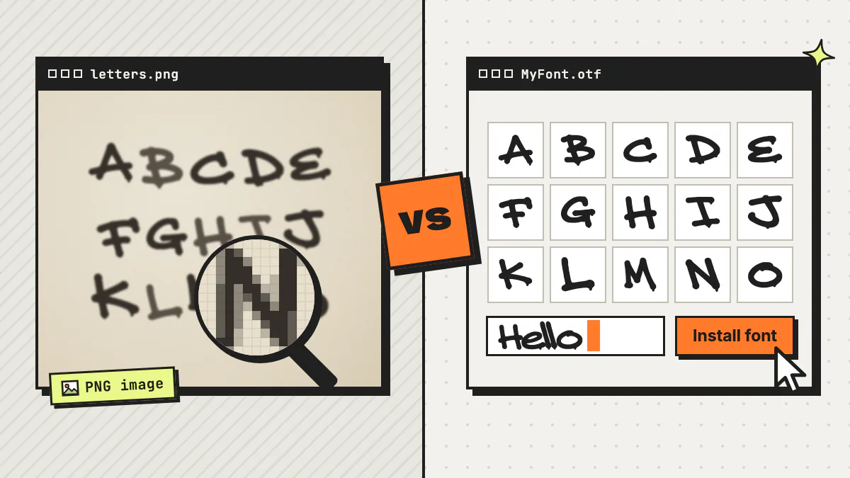
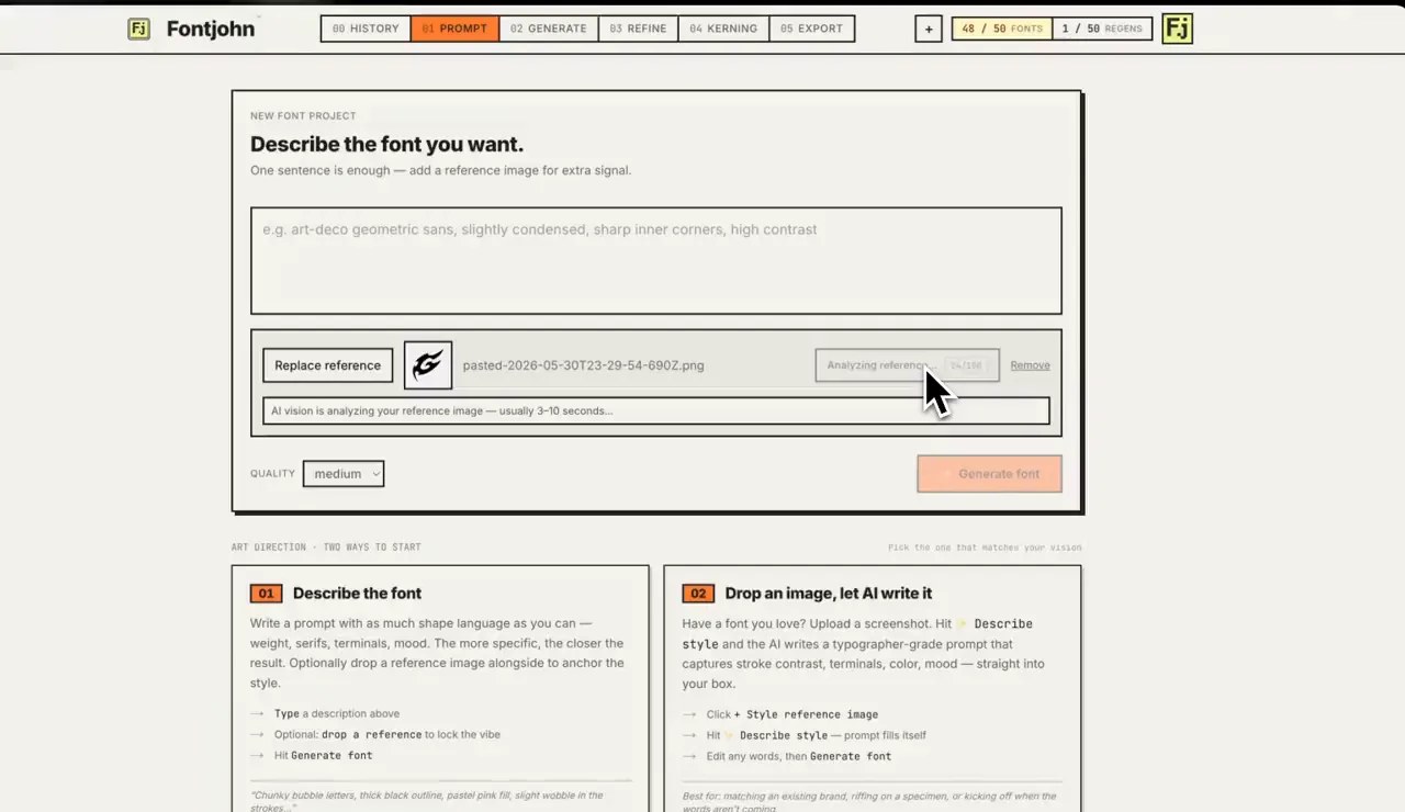
Have a photo of your own shop’s old sign, or a sketch? Attach it as a reference image, and Fontjohn’s Describe style button writes a style description of the image into the prompt, ready for you to edit. When your brief is ready, try it in Fontjohn.
How do you roll out a new brand font?
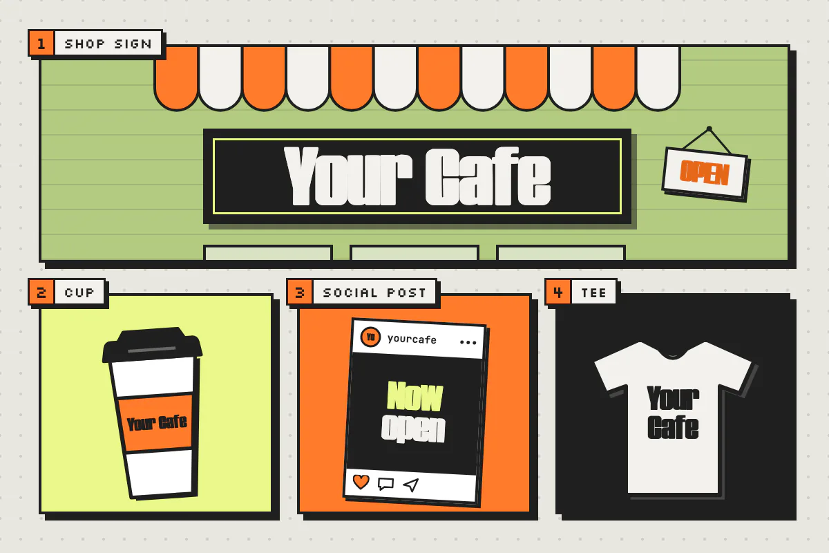
Roll out a brand font from the most visible, longest-lived assets down: logo and wordmark first, then packaging and signage, then social templates, then your website as a WOFF2 web font. Install the font for everyone who makes materials, and write a one-page type guide so it gets used the same way everywhere.
Set the logo and wordmark
Type your brand name and fix awkward letter pairs by eye. In Fontjohn, the Kerning step has a pair editor and a letter-spacing control, and your adjustments are baked into the exported font. Then set the wordmark in your design app and save it as vector artwork for printers and sign makers.
Test it on packaging and print
Print real proofs at the smallest size you’ll use, like a sticker or cup label. Detailed styles that look great big can clog up small; if they do, use your text font for small print.
Check signage from a distance
View a mockup from across the street, not across your desk. If thin strokes disappear, try a heavier weight: on Fontjohn’s Pro and Studio plans you can derive Light, Medium, SemiBold, Bold and Black from your finished Regular and download them as one family.
Build social templates
Install the .otf or .ttf on every device that makes content, then build reusable templates for posts and stories. Our guide on installing fonts on Mac, Windows, iPhone, Canva and Cricut covers the setup.
Add it to your website as WOFF2
Upload the WOFF2 file and load it with a CSS
@font-facerule. MDN’s web fonts guide notes that all major browsers support WOFF and WOFF2, and recommends listing WOFF2 first. Use the brand font for headings and your text font for body copy. On Pro and Studio, Fontjohn exports WOFF2 alongside .otf and .ttf.Write a one-page type guide
List the two fonts, weights, sizes and a few do’s and don’ts, and share it with staff, freelancers, your printer and your sign maker. Consistency only happens if people know the rules.
Frequently asked questions
Does a small business need a custom font?
Not always. A well-chosen font used consistently is enough for many small businesses. A custom font earns its place when you want a look competitors aren’t already using, when your brand shows up on lots of physical and digital touchpoints, or when per-use license fees start adding up. If you’re still defining what your brand stands for, settle that first.
How much does a custom font cost?
It depends on the route. Type designer Thomas Phinney’s 2024 estimates put a commissioned typeface at as little as $8,000–25,000 per style from early-career designers, roughly $30,000–75,000 for a four-style family from established designers, and $100,000–250,000 or more for a four-style family from famous names. Customizing an open-source font costs your time or a designer’s hours. An AI font generator like Fontjohn lets you design and type-test one font a month free; downloading needs a paid plan, such as Pro at $20 a month (as of September 2026).
Can I use an open-source font in my brand logo?
Yes, if it’s released under the SIL Open Font License. The official OFL FAQ lists logos, signage and t-shirts among the design work you can make with OFL fonts, and you remain the copyright holder of the artwork. The catch is exclusivity: anyone else can use the same font. If you modify the font and distribute it, the modified version must stay under the OFL. This isn’t legal advice, so always check the license file included with the font.
What font format should I use for my brand’s website?
Use WOFF2 for the web. MDN’s web fonts guide notes that all major browsers support WOFF and WOFF2 and recommends listing WOFF2 first in your @font-face rule. Keep the .otf or .ttf versions for installing on computers and sending to printers.
Can I use a Fontjohn font commercially for my brand?
Yes, on a paid plan. Fontjohn’s terms say you own the fonts you generate, and paid downloads include a commercial license with no royalties and no watermark, so you can use them for brand identities, products you sell and client work. You can’t use Fontjohn to make ripoffs of proprietary typefaces or trademarks. The free plan lets you design, refine and type-test one font a month in the browser, without downloads.
How many fonts should a brand use?
Many brands do well with just two: a distinctive display font for the logo, headlines, packaging and signage, and a highly readable text font for body copy, menus and small print. Use different weights of those two fonts for hierarchy before adding another typeface.
Give your brand its own letters
Describe your brand’s style or drop in a reference image, and Fontjohn generates a complete font you can type-test right away. Upgrade when you’re ready to download it for your logo, packaging and website.
Make your brand fontFree to design and test. Downloads start with Pro.